App design for last-minute outings in Paris
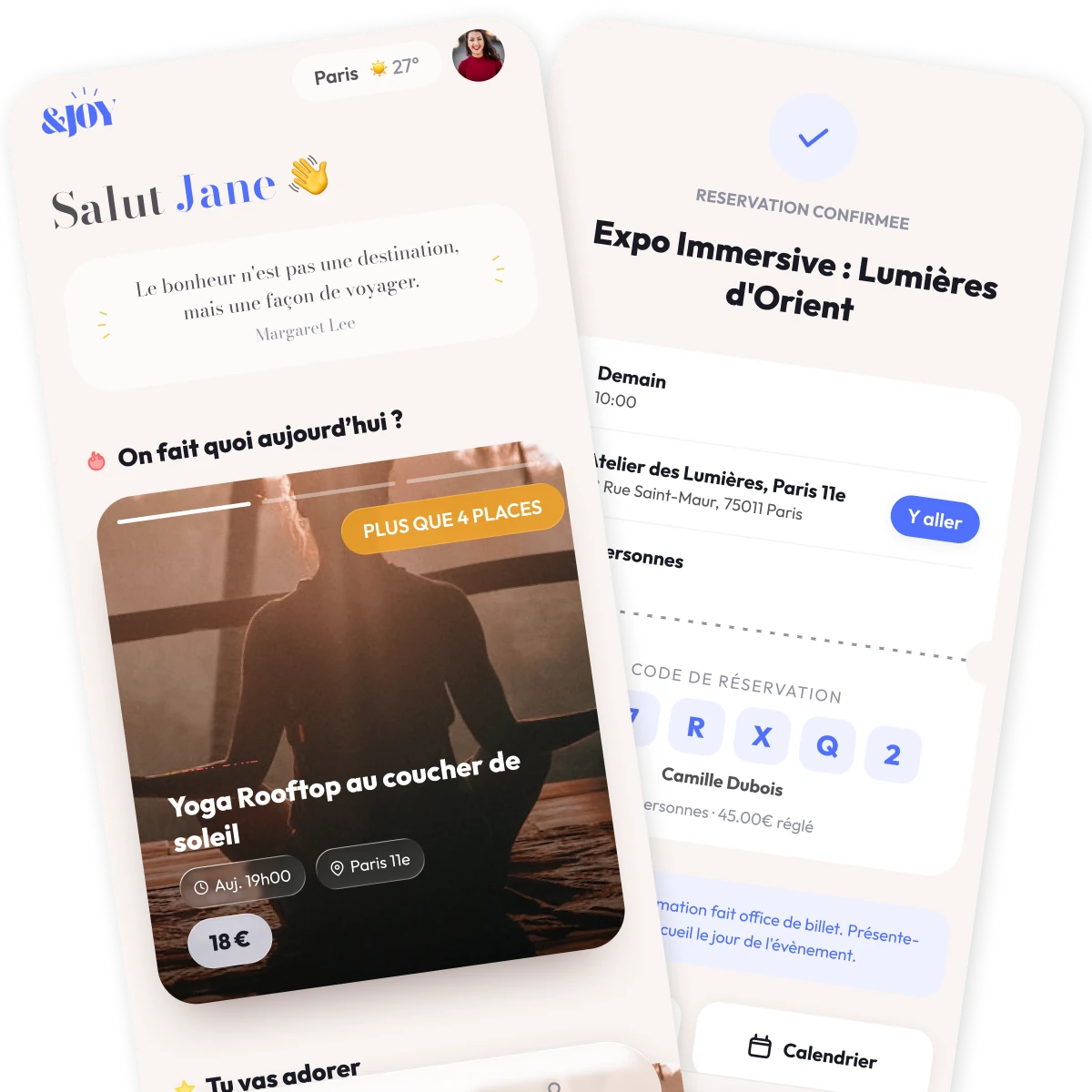
The "Too Good To Go" of Parisian leisure.
I joined the &joy project when it was still a concept. A few screens made with Lovable, but mostly a great idea: what if someone turned last-minute unsold spots into spontaneous Parisian experiences, the way Too Good To Go turned unsold food into a market?
Before any real design work began, I helped shape the app's positioning and identity: what &joy should stand for, and what voice it should carry.
From there I took the project end to end, in six steps: strategy, artistic direction and design system, screens and flows, a realistic AI-powered prototype, user tests and technical specifications. Each section below carries the number of its step.
Positioning, analysis of the founder's interviews, design principles, V1 scope
Palette, typography, shape language and voice, built into 12 tokens and reusable components
Every screen and the five key moments, from onboarding to ticket
A realistic prototype used for the user tests, improved after each round
17 participants · 2 waves · 45-minute interviews
Specifications written for the developers during the build
From a hypothesis to a clear problem
Before designing anything, the founder and I wrote down what we believed. The interviews then reshaped it into a problem we could design for. The principles below are how I answered it.
The main problem was choice overload in a buzzing city, and smaller events struggling to find their audience.
The founder ran the first interviews and I analysed them. They proved us half wrong.
Finding something to do is stressful. The options are everywhere but scattered and unorganised, and the events people hear about are already sold out.
Three decisions that shape the experience
30 hand-picked, verified activities beat 300 unfiltered listings. The catalogue should be a quality promise, not just a suggestion.
Onboarding to booking confirmed should be under 2 minutes. Every tap that can be removed should be.
From "Salut Jane 👋" to human-written activity descriptions, the app speaks with warmth and a real voice. In a category of generic platforms, tone of voice is the brand.
Warm, human, and deliberately un-corporate
Aa
Cormorant Garamond · Editorial serif
Rounded sans-serif · All UI text
Two voices. One for curation, one for clarity.
Typography · Dual type systemWhat are we doing today?
💡 Your code is your ticket. Just show it at the entrance.
Only 4 spots left!
UX writing · Friendly & warm Only 4 spots left
Rooftop Yoga at Sunset
18 € Clarity firstThe app in 5 key moments
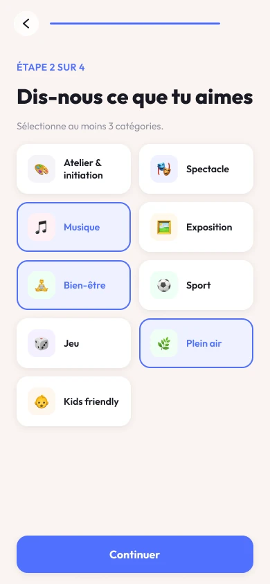
An onboarding flow that gets straight to the point
Users reach a personalised home without a lengthy setup. They are mainly asked about their preferences, so that the activities suggested on the homepage suit them.
The first screen after onboarding already shows activities that fit.

A home that curates, not just lists
The home opens with your name, the day's weather, and one activity singled out with a live scarcity badge. Team picks. Personal recommendations. What's happening nearby. Three sections, three different reasons to open the app.
No generic feed. Every section has a reason to be there and a reason to be different tomorrow.
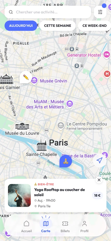
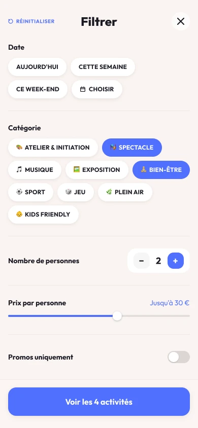
Explore the city, your way
Every category gets its own emoji pin on the map. A 🧘 for wellness, a 🎭 for culture, a 🍽 for food. The city becomes readable and diverse at a glance. A list toggle lets users compare activities side by side without losing the spatial context.
I built the filters around real usage patterns from research, not around what I assumed people wanted: a rolling 7-day date strip (not just "tonight" or "this weekend")*, a category picker, a price range slider, a headcount picker, and a promo toggle. Every filter answers a question users actually asked.
*13 / 17 participants needed date-specific filters.
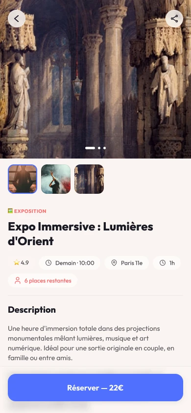
The page where the decision happens
A swipeable photo gallery sets the scene before anything else. Below it: a rating, a metro stop, a duration, a cancellation policy, and a live scarcity count. The included/not-included and "Good to know" sections remove the last source of ambiguity before payment.
I deliberately left reviews out of V1. That call turned out to be wrong, or at least incomplete, and I added them back in gradually based on user feedback*.
*14 / 17 cited missing reviews as their top friction.
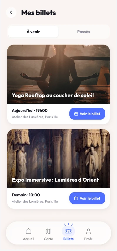
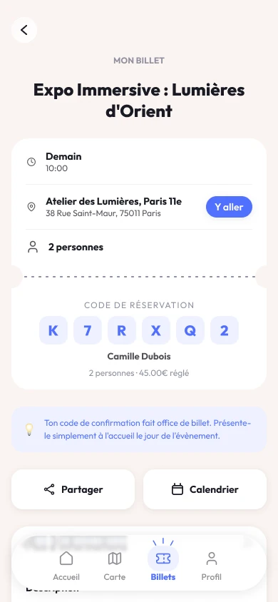
Code, QR, or both?
Venue professionals are diverse, and not all of them have a scanner. I first chose a 6-character code over a QR: it works with a tablet, a printed list, or just a pair of eyes.
The question had a big impact on the product, and we finally offered both. The QR code is scanned with the partner's own phone, with the app installed and signed in with a partner ID. Each venue uses whichever suits it.
Almost all users said they expected a QR code here, but none asked for one back after seeing the code and reading the note below.
Talking with venue professionals made it clear that the QR code was needed for effectiveness.
A realistic prototype, improved after every test
Static screens can't show whether people trust a booking page. So I built a realistic, AI-powered prototype and used it for the user tests. Each round changed it: team recommendations after the first, the ambassador system after the second. The final version went to the developers as the reference for how the app should behave.
Screens and components
A realistic version people can test
Could not commit without reviews
Team recommendations added
Did not trust team reviews
Ambassador reviews added
V2 used as the reference
Testing the prototypes
Working alongside the founder, I ran two rounds of user testing across the project. We were not looking to confirm what we already thought but for where we were wrong.
One finding came up in nearly every session: users could not commit to a booking without reviews. The aggregate score told them how many people had gone. It told them nothing about whether they should.
In V2, we introduced the &joy team's own recommendations, written with conviction, the way a bookseller recommends a book. But testers explained they couldn't trust a review written by the people selling the experience…
A score without comments was seen as invented. "21 reviews and I can't read them." The trust gap on the activity page was the sharpest finding of the study.
"It's the &joy team saying it's good... Obviously, they won't say it's bad." Team reviews were read but not trusted.
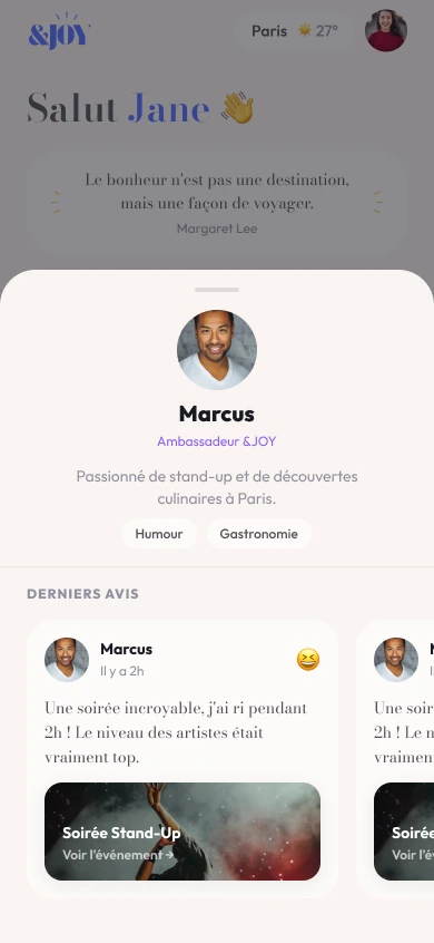
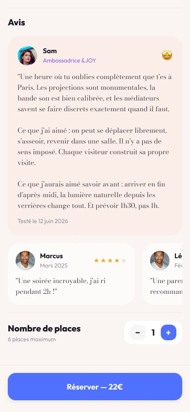
Trusted by the community, approved by the city
Ambassadors are not hired reviewers but selected users based on how well they know the city and their online reputation. The app gives them early access to new activities for free. In return, they write a detailed, signed review, attached to their name and their reputation. That's what makes it readable, where the team's own voice wasn't.
Ambassador reviews are visually highlighted and appear alongside standard user reviews, without replacing them. The mechanism goes further than just reviews: an activity that does not earn ambassador approval does not enter the catalogue. Ambassadors are not just the voice of the app. They are its quality filter.
Staying on the project during development
Handing over a prototype is not the end of the job. While the developers build the app, I write the technical specifications they need, and the V2 prototype stays their reference for how every screen should behave.
The reference for how the app behaves
What the developers need to build it
The app is being built
Scheduled for release

From concept to final prototype in less than 1 month
I joined the &joy project to help with positioning. Seventeen interviews and dozens of iterations later, the final prototype was handed off to developers. I ended up covering the whole chain: product strategy, artistic direction, design system, interface design, an AI-powered prototype, user tests and technical specifications.
The V2 prototype has been handed off to developers. The app is scheduled for release in late 2026.