 Calorie-Tracking App
Recipe section redesign for a calorie-tracking app
Users weren't using an entire section of the app.
Parrot Pal's Food Center section was initially created to enhance the user experience once they have entered their meals in the log section.
But when I looked at the data, most users visited the Food Center once and never came back, even though it's accessible directly from the app's tapbar.
UX/UI Analysis
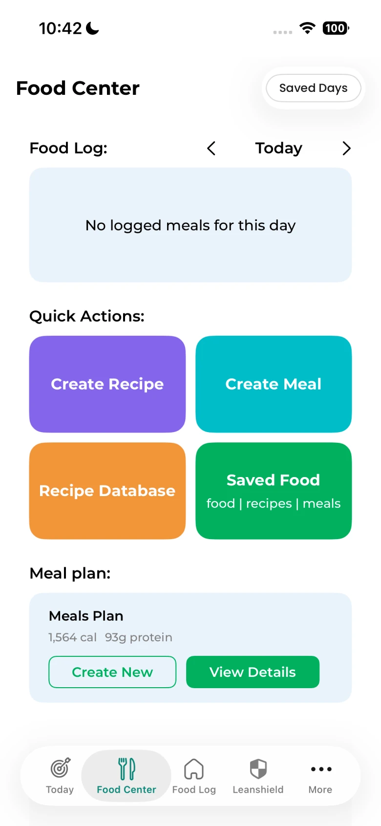
The Food Center was a catch-all section mixing custom food creation actions with a food log summary, a recommended meal plan for the day, and uncontextualized recipe suggestions. Users had no clear idea what the section was actually for.
-
Unclear purpose Users didn't understand what the page was for or what actions to take.
-
Low perceived value The benefits of each feature were unclear or not immediate.
-
UI inconsistency The design didn't match the rest of the app, reducing trust and coherence.
-
Misplaced content The food log summary added noise and didn't belong in this section.
Users don't explore features. They respond to clear, immediate value.
Four decisions that shape the experience
Show users what they actually need.
Show value immediately, not after exploration.
Noise reduces trust and clarity.
Consistency builds confidence.
Refocus the section around the main added value: help users cook according to their needs
New flow:
Constraints & design implications
- Navigation locked Redesign stays within the existing tab layout.
- Shared component library New patterns documented and contributed for reuse across the full app, not built in isolation.
- API shape unchanged All improvements are render-layer only. Data fetching and recipe model stay untouched.
Identify what matters
I expected food creation to come out on top in the workshops. It didn't. Two other features kept coming up instead.
- Meal plan: users wanted a coherent daily plan
- Recipe browsing: users wanted relevant inspiration
Remove noise
I pulled the food log summary out of this section entirely. Keeping it next to recipe discovery was creating two competing jobs-to-be-done: users couldn't tell if the page was for tracking or for cooking.
- It was relocated to the "Today" page, where it naturally belongs.
- This reduced cognitive load and clarified the purpose of the page.
Make recommendations relevant
I redesigned recipe suggestions around remaining daily calories. I didn't want to build another generic recipe library, that fight is already lost. The one thing ParrotPal actually has that no competitor does is the user's remaining macros for the day, so I anchored everything to that instead.
- Users now see only recipes that match their remaining daily calories.
- This turns recipe browsing into a personal, actionable tool rather than generic content.
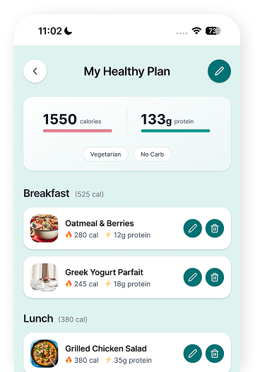
Redesign the meal plan
I built a full daily plan aligned with the user's calorie target, instead of one-off suggestions. One recipe at a time still leaves the question hanging: what else do I eat today? A full plan closes it. One action, the whole day handled.
- Instead of generic suggestions, users get a coherent plan for the day.
- Meals are ranked in categories: breakfast, lunch, dinner, and snacks.
- The calorie goals are set by default to match the daily ones, but can be adjusted by the user to achieve specific results.
- When a recipe from the Plan is logged, it automatically updates the Plan's calories and proteins counter.
Improve the recipe experience
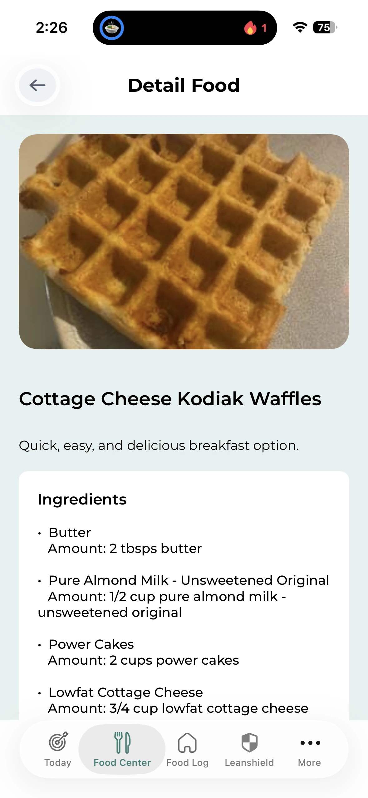
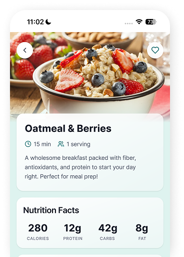
I redesigned the recipe page to be more appealing and easier to browse. I was tempted to just show everything and let users filter it themselves, but too many choices trigger decision fatigue. I curated the list and filtered it by calorie fit instead, a shorter list makes people more likely to actually act.
- Each recipe card leads with a photo, calorie count, and macros, all visible before tapping.
- Limiting the number of recipes to keep only the best ones.
- Like option to save the recipe in a list of favorites.
- The goal was to make recipes feel desirable, not only functional.
Align the UI
I redesigned the entire section to match the rest of the app, while making sure it could still stand out on its own. A section that looks off-brand reads as forgotten, and I wanted consistency to be what tells a user this is worth a second visit.
- Consistent components and improved hierarchy.
- Modern UI that fits in with Apple liquid design.

A focused entry point for daily meal decisions
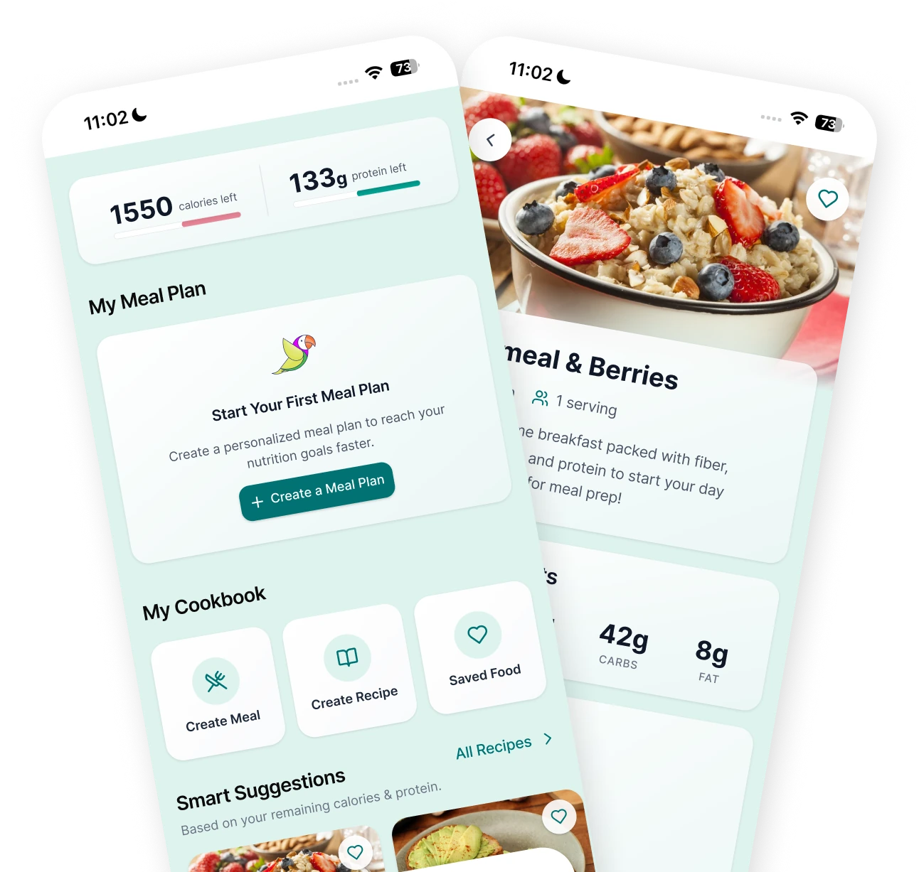
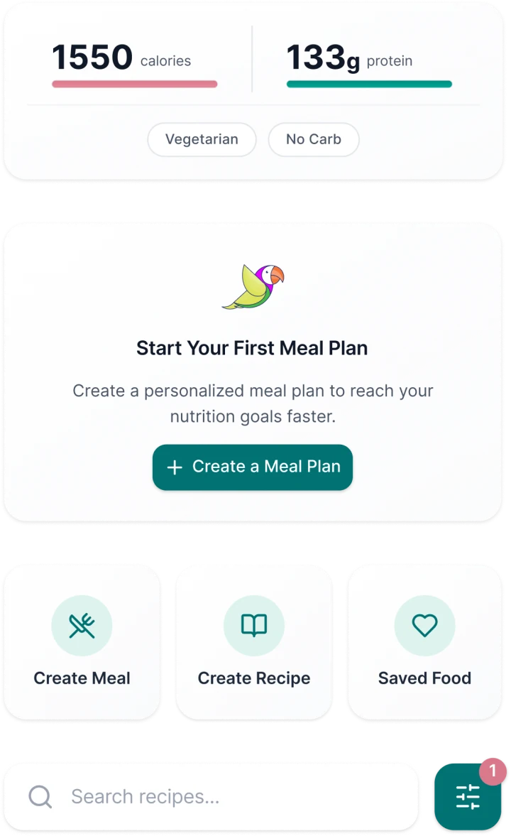
The Food Center now opens with the user's remaining calories and proteins for the day. They can create a personalized meal plan based on these metrics, create their own meals or let themselves be tempted by delicious recipes, all tailored to their needs.
- Calories & proteins remaining for the day, shown upfront
- Personalized meal plans built from daily goals
- Recipes and custom meals tailored to individual needs
Results
Monthly return rate to the Food Center rose from 31% to 38%, driven by better content discoverability and a more engaging entry point.
Taps on recipes and meal plans increased sharply, with the new visual hierarchy and contextual surfacing driving more intentional browsing.
Free-to-paid conversion rate rose from 4.2% to 4.7%, with more users reaching the paywall after engaging with premium recipe content.
Boost Food Center usage by increasing its visibility
Following the Food Center success, I worked on a new onboarding tutorial to better explain the structure of the app and drive users toward the section. The main goal was to capitalize on the positive metrics generated by the new Food Center by increasing its visibility, while improving onboarding clarity for first-time users.
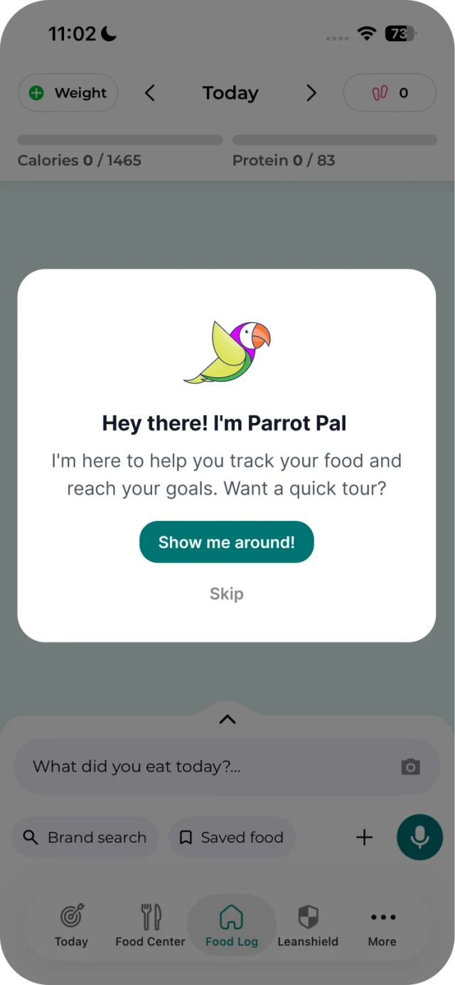
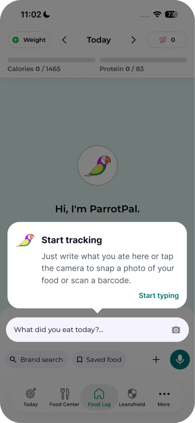
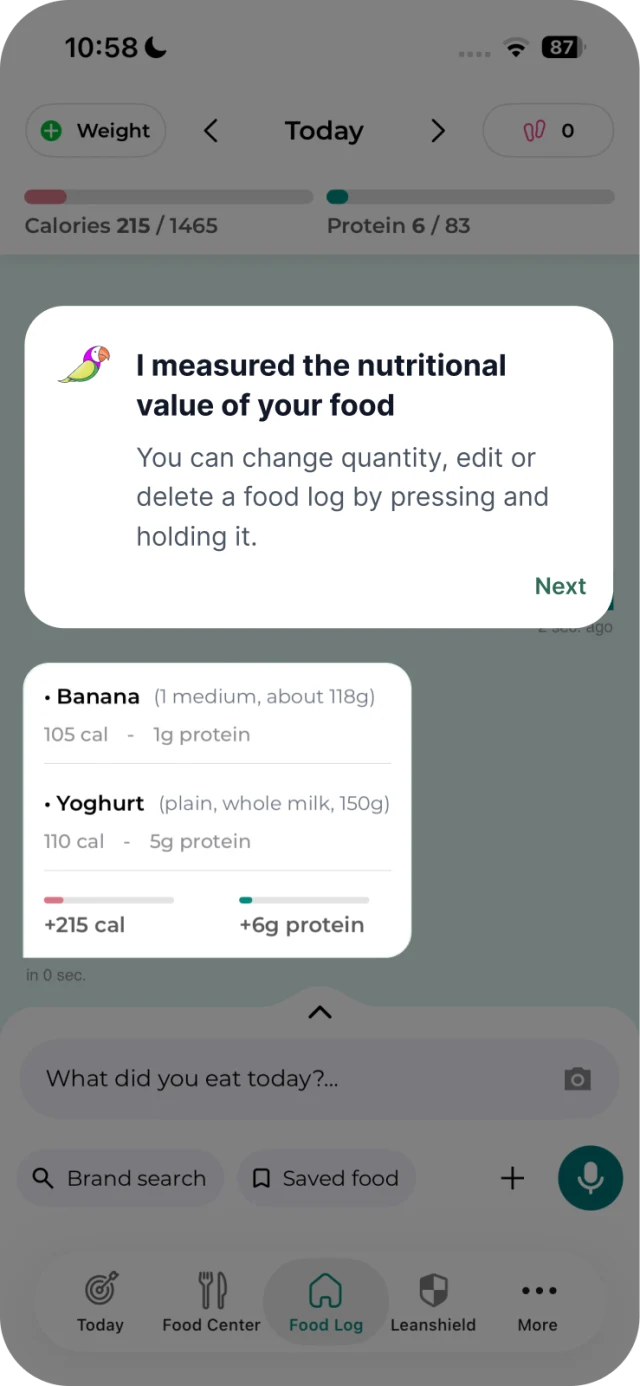
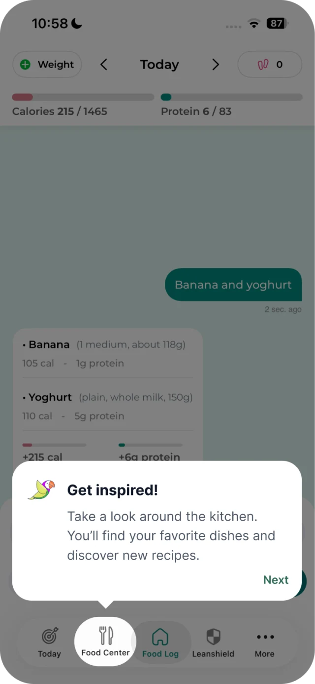
The new onboarding drove a good increase in Food Center visits among first-time users.
This led to a further increase in the trial conversion.