 Habit-Tracking App
Improving the core feature of a habit-tracking app
Users found creating a task to be complex.
Initial configuration is the core activation moment, and this is even more true for a habit tracking app like Grit.
But when I dug into user feedback, creating a habit felt complex and time-consuming to many users, even though the system technically allowed quick creation. I had assumed the problem was the number of steps. It wasn't. It was perceived complexity.
UX/UI Analysis
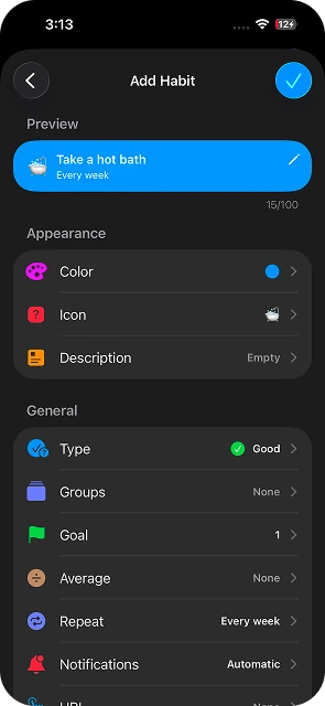
Users were confronted with a list of 13 settings options all before a single action was done. While core users appreciated the level of customization, new users felt overwhelmed by the number of options. The app's UI was satisfying and was not considered a priority.
-
Form anxiety Too many visible options created pressure before action.
-
Decision fatigue It's hard for the user to tell which action is useful and which isn't.
-
Lost in progression The lack of interaction makes it hard to say what changes have been made.
Users don't want to configure a tool. They want the tool to adapt to their needs.
Four decisions that shape the experience
Limit the number of steps before achieving the task to increase satisfaction.
Creating a simple task should be simple.
Show more only when needed.
The system should anticipate user's next actions based on their actions.
Limit manual actions through a smart text field that recognizes and pre-configures key settings.
New flow:
Constraints & design implications
- Minimum redesign The current UI should be preserved. Changes are additive. No screen gets rebuilt from scratch.
- Apple Intelligence alignment The recognition field must fit within Apple Intelligence's current system conventions: visual language, interaction patterns, and on-device processing expectations.
Instant creation
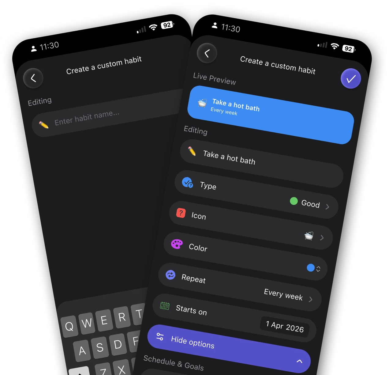
I reduced creation to one text field. The old flow needed 7+ steps before a habit was even saved, and the drop-off data was blunt about why: people weren't rejecting the feature, they just didn't want to do the work to get to it.
- Users type the habit name and press enter.
- They can save. The new habit is created.
Smart recognition
I had the system pre-fill common values based on the habit's name. I worried this would just feel like the app guessing wrong, but pre-filling avoids blank-form anxiety without removing control. Users override only when needed, less often than I expected.
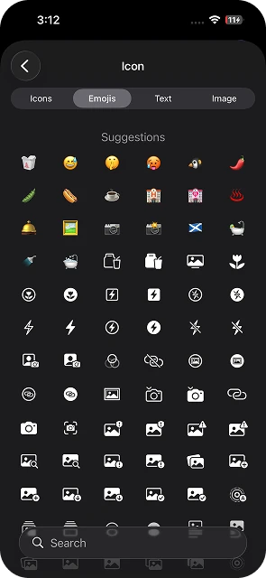
- An icon is automatically suggested based on the habit's name.
- By default, the "Habit type" is set on "good" (green color). If the negative form ("Stop", "Do not"…) is used in the name, the habit transforms into a "bad" one (red).
- Similarly, a habit is "daily" by default. If another frequency is mentioned in the name, it will automatically update the setting.
Make the experience lively and dynamic
I made every change show up in the preview immediately. Without that, users are stuck mentally simulating the result, guessing whether the system understood what they typed. Seeing it happen removes the guessing.
- Users see the impact of their settings right away.
- In this way, they directly identify how the system works.
Interconnected options
I display advanced options based on how relevant they are to the user's context. Showing everything at once overwhelms casual users; hiding everything frustrates power users. I wanted an approach that served both without compromising either, so options reveal themselves only when they're actually relevant.
- By default, the frequency is set to "Daily." If the user changes this setting, they are offered to set a start date.
- If the user adds a start date, then we offer them to set an "End date", etc.
Reveal complexity progressively
I moved all advanced options into a secondary screen. I'd considered cutting some entirely, but early testing showed that removing options outright triggered real pushback from power users. Hiding them behind "Show more options" preserves full control while keeping the entry point clean. Nothing removed, everything deferred.
- Not used options are hidden by default in a "More options" section.
- When enabled, they are automatically displayed so that the user can have a clear overview of their actions.
- Nothing is removed. Everything is just delayed.

One field to rule them all
With a single action, users can set up their core settings in a smooth, progressive and natural way.
By minimizing friction, the new design allows users to focus on what matters most: improving their habits.
- Single text input for instant habit creation
- Smart recognition auto-fills type, icon and frequency
- Live preview reflects every setting change in real time
- Advanced options revealed progressively, nothing removed
Results
New users completing their first habit creation rose from 32% to 40%, driven by reduced friction in the redesigned task flow.
Median time to create a habit dropped from 49s to 36s, as the new flow eliminated redundant steps and surfaced key options earlier.
Projected increase in lifetime value, modelled from improved retention and task completion rates post-launch.
What I'd improve next
The redesign improved first task completion and habit retention, but the recognition system still relies on rule-based matching. Here's where I'd invest next.