 Running App
Onboarding redesign for a running app
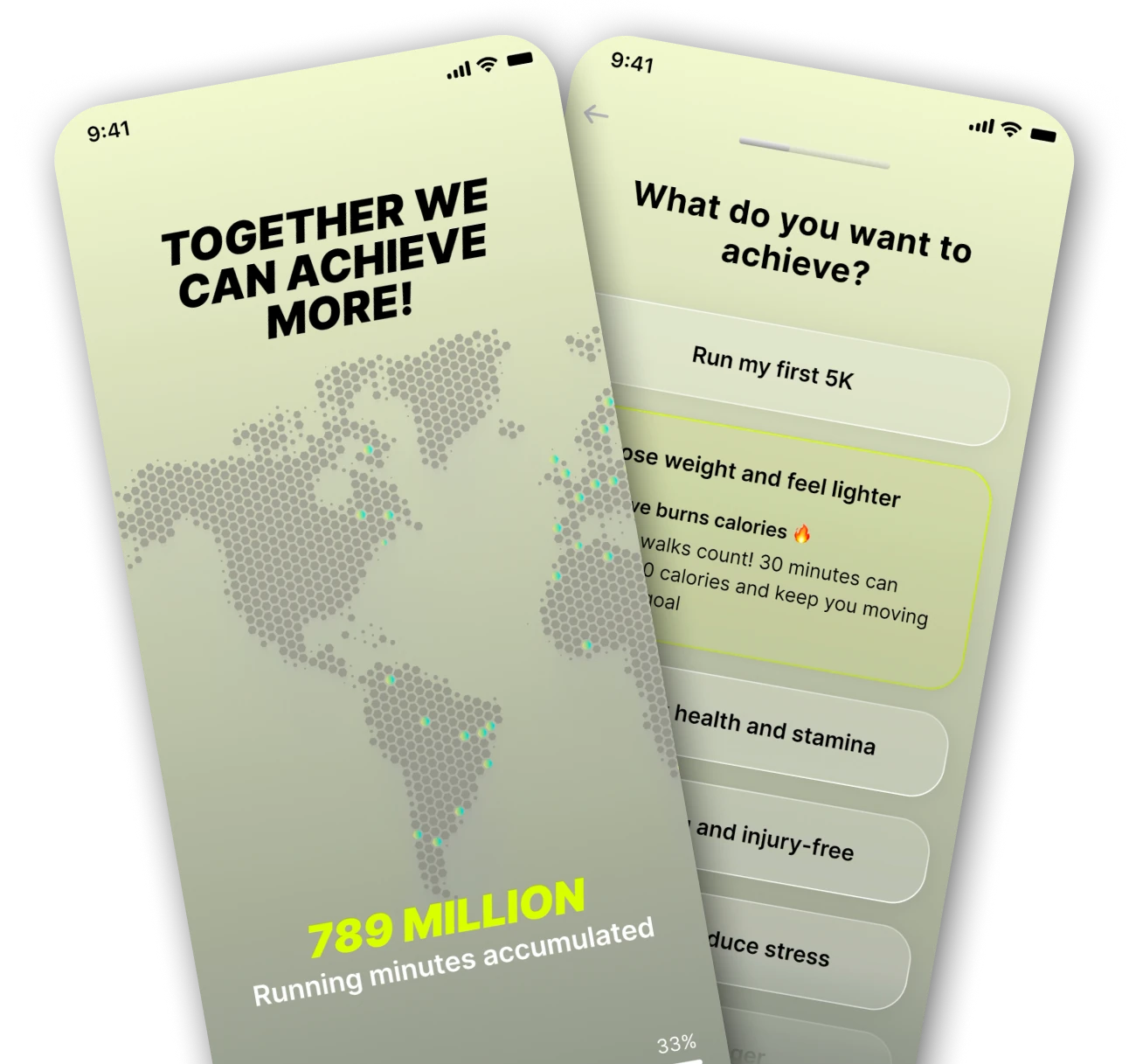
The onboarding flow felt outdated and generic.
Couch to 5K is a running app designed for complete beginners to help them complete their first run.
Onboarding defines the first impression, especially on a running app, and I knew we needed to identify and address each user from the very start. But all users were going through the same process, with questions that seemed ill-suited to their profiles. The low first-run completion rate confirmed it: when users feel the plan wasn't made for them, they don't follow through.
UX/UI Analysis
The onboarding collected basic user data, but that was not enough to identify the user's profile and adapt the experience. Almost every user landed on the same beginner plan, regardless of why they were there or how fit they were.
-
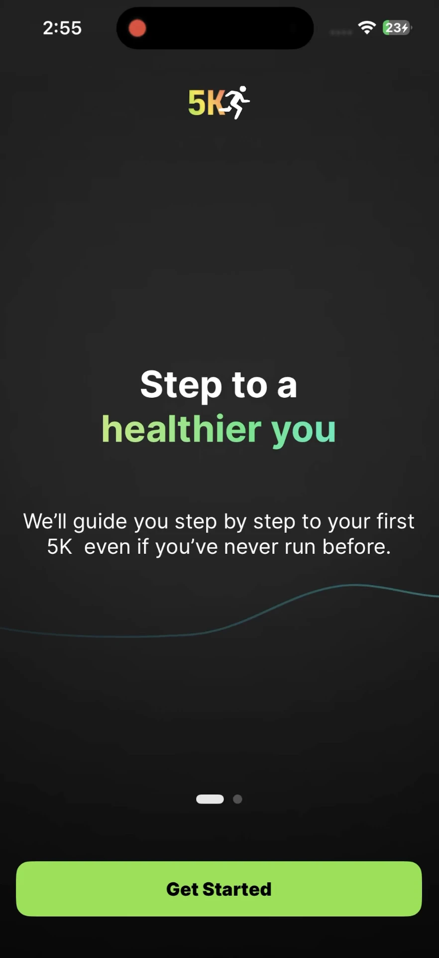
No goal alignment Users were asked about their main goal, but this did not affect the rest of the flow.
-
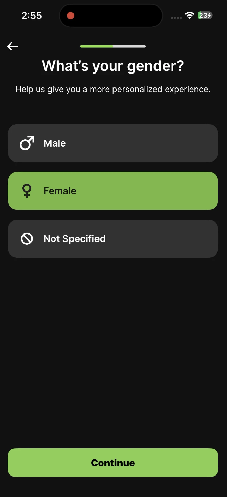
One-size-fits-all The same plan was recommended to almost all users, suggesting the questions, or the plans themselves, weren't matched to who was actually asking.
-
Outdated design UI was inconsistent with the rest of the app, which had recently been completely redesigned
Users don't want a program. They want a plan made for them.
Four decisions that shape the experience
Get to know the users better before anything else.
Essential to properly identify the user being onboarded.
Show users that we're listening to them.
Work within the design system while improving it.
Shifting from a linear onboarding to adaptive flows
New flow:
Constraints & design implications
- Design system The new onboarding's design must fit the app's V2 design system already used everywhere else in the app, including when creating new components.
User data analysis
I dug into the user data with the data team lead and built personae to keep each profile in mind while designing. The app had assumed every new user was a complete beginner. The data said otherwise, a wider range of profiles than the existing flow was built for.
- Each persona maps to a distinct set of questions, fitness assumptions, and plan recommendations.
- Discovering that 10–20% of users couldn't yet run was the direct trigger for the Safe Start Program.
Personalized flows
I branched the onboarding flow based on the user's selected goal. The alternative was one longer, universal flow covering every scenario, and I was worried that would just feel like a survey. Branching on stated goal means each user only answers questions relevant to them.
- A "Weight loss" goal triggers fitness and health questions; a "Get active" goal focuses on schedule and motivation instead.
- Each branch is shorter than the old universal flow, reducing the number of steps before the plan is generated.
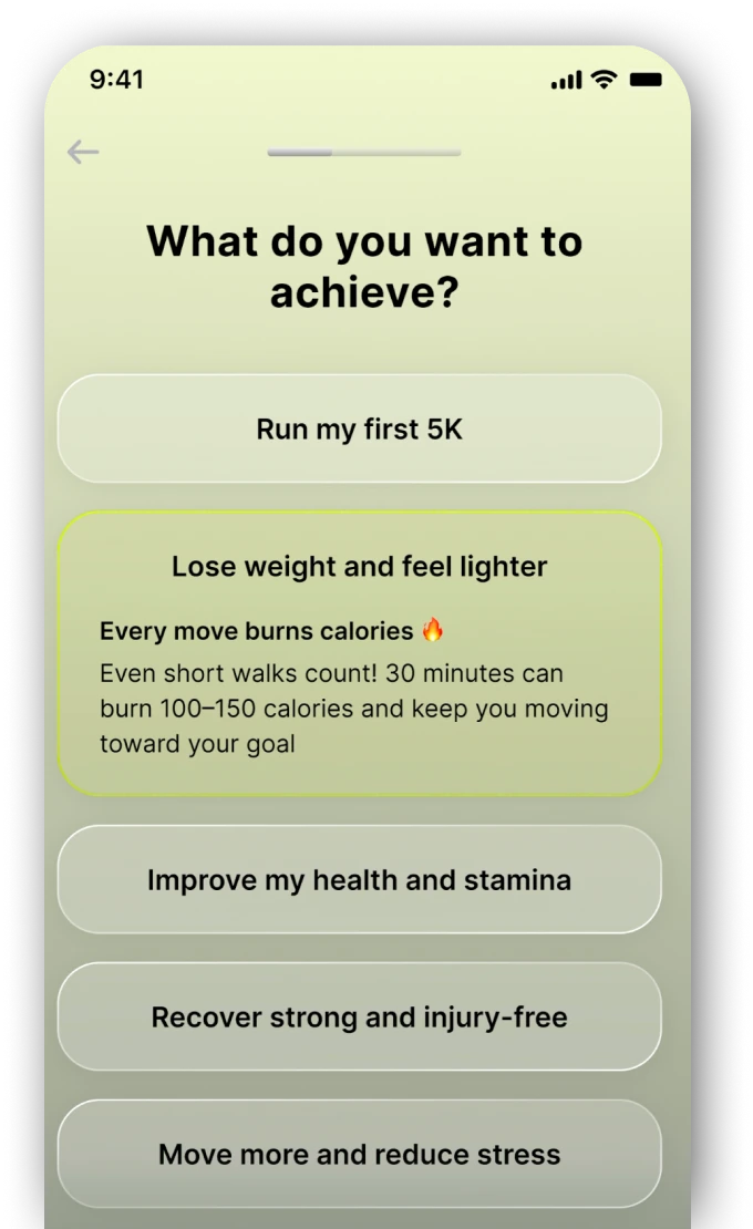
Dynamic content & UX writing
I had each answer trigger a specific message with helpful advice or encouragement. The old onboarding was purely transactional: answer, next, answer, next. A contextual response proves the app actually read the input, which matters disproportionately at sign-up, before any trust has been built.
- A user who mentions injury gets a careful, reassuring message, not the same copy as someone who is just short on time.
- The writing was crafted per answer option, not per screen, so tone matches context at every step.
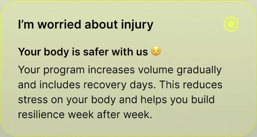
Address all users
User analysis showed that 10-20% of users weren't ready to run yet, so I designed the "Safe Start Program." A modified beginner plan wasn't enough. People in physical recovery need different intensity targets, rest intervals, and safety messaging, and at that share of installs, I couldn't justify designing them out.
- A specific program for the most sensitive users (highly overweight, recovering etc.)
- Fitness-related questions help ensure the program is pushed to the right users.
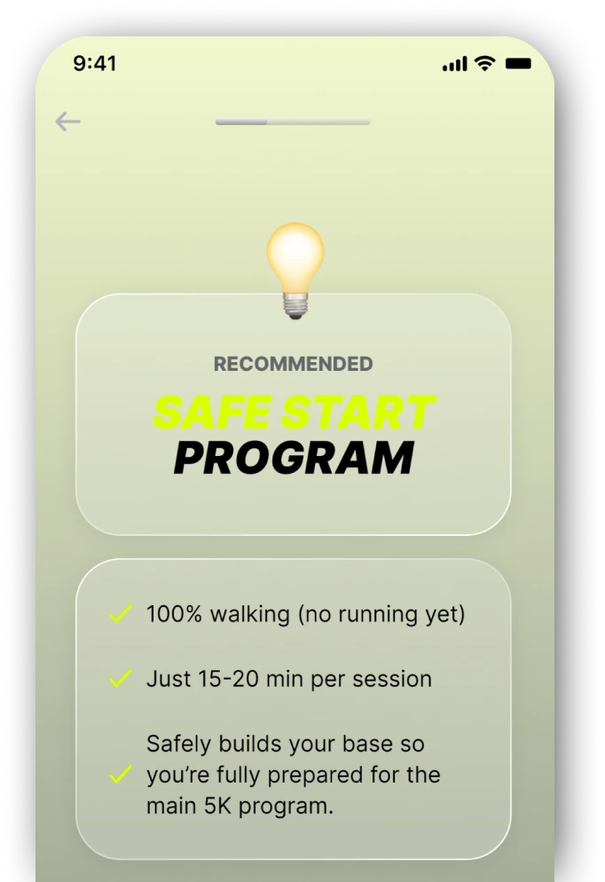

An onboarding experience tailored to users
Based on user responses, the flow now branches into tailored paths, allowing us to ask more relevant questions, provide more personalized content and generate a plan that better fits each individual's needs, which is especially important for beginners with specific health or fitness concerns.
- Flow branches based on stated goals, no generic path
- Dynamic content and UX writing personalized per user
- Safe Start Program for users with health constraints
Results
Completion rate across all onboarding steps rose from 54% to 66%, with the adaptive flow reducing drop-off at each decision point.
Trial-to-paid conversion among users who completed the new onboarding, supported by stronger goal-setting and early value delivery.
Day-30 retention for users who went through the new onboarding, with personalised starts building stronger early habits.
What I'd improve next
Personalised onboarding moved conversion and retention, but the training plan itself remains static once started. These are the areas where the design has the most room to grow.