 Travel Platform · Website
From first
sketch to a site
the client
can run
A founder with a clear idea, and nothing built yet
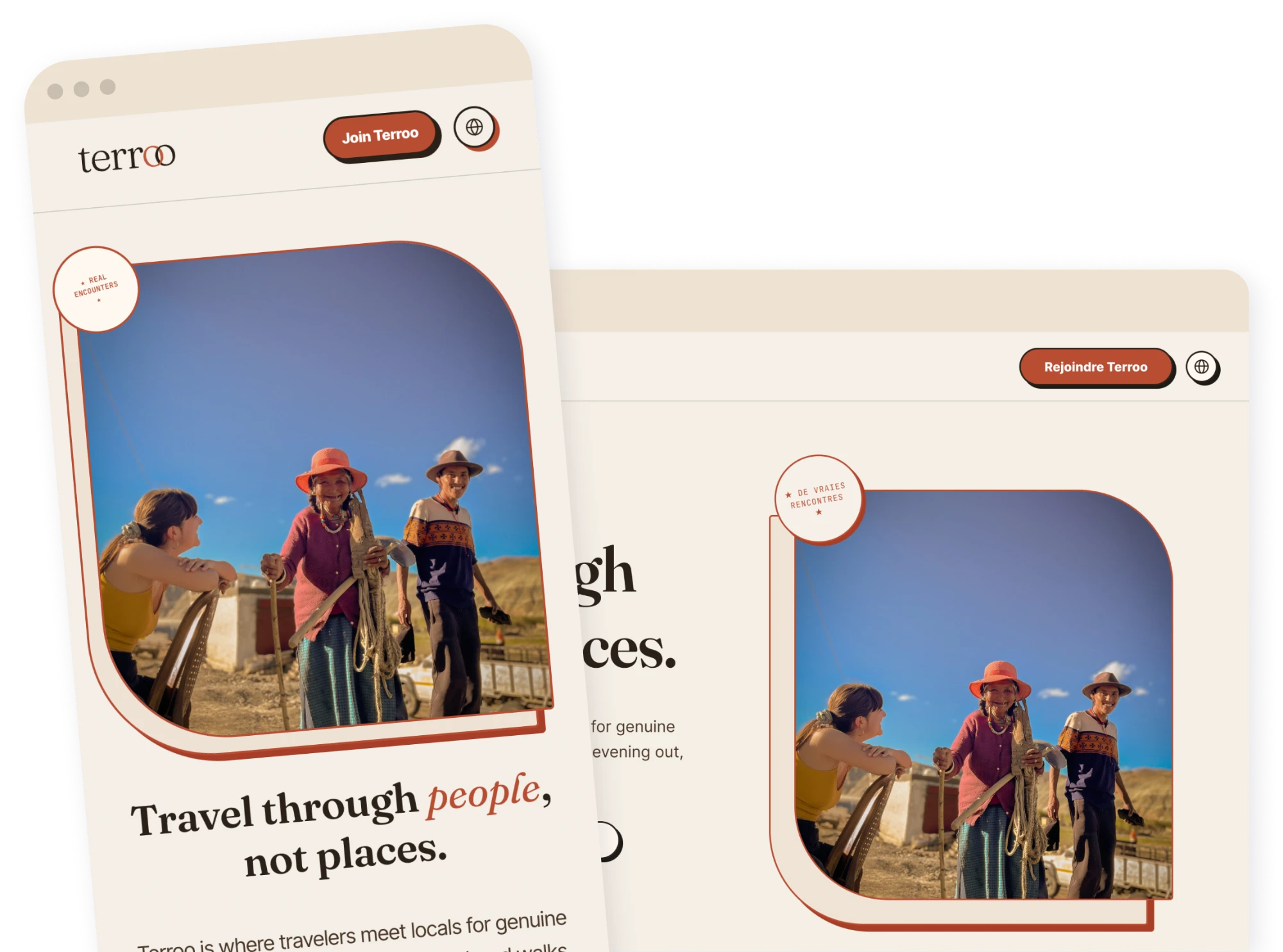
Terroo is a free platform where travelers meet locals for real encounters: a shared meal, a neighbourhood walk, an evening out. There's nothing to book and no guide standing between you and the person you're meeting.
The brief was to build a website anchored by a landing page strong enough to make people want to join a platform that didn't exist yet. I came on before a single screen existed, starting with an art direction that translated the founder's concept into something visual. From there I designed the full set of screens and built them into a WordPress site the founder could administer herself, with SEO research shaping the structure and copy from the first wireframe rather than bolted on at the end.
Logo mark, palette, type system
Homepage through legal pages
Custom theme, editable from the back office
English, French, Spanish
Keyword research, on-page structure
Four decisions that built the brand
Most travel startups reach for a clean grotesque and call it done. I paired Fraunces, a serif with a slightly rough, hand-set quality, against Inter Tight for body copy. The serif carries the brand's voice; the sans keeps everything else legible.
Travel through people.
Fraunces / Inter Tight
Every booking app defaults to blue. I built the palette around a sun-baked rust on a paper-like cream, closer to a passport stamp than a SaaS dashboard. It reads as warm and analog before a single word is read.
I was tempted to lay the experience photos out in a clean, even grid, the way every other travel site does. That felt like it belonged to the same category of app Terroo is trying not to be. Pinning each photo like a postcard, tape and all, makes the encounters feel handed to you personally.
Every pill button carries a second, darker shape offset behind it, like a stamp pressed slightly off-register. It's a small detail that shows up on every CTA on the site, and it's the detail that made the whole brand feel tactile instead of templated.
The result: a real component library
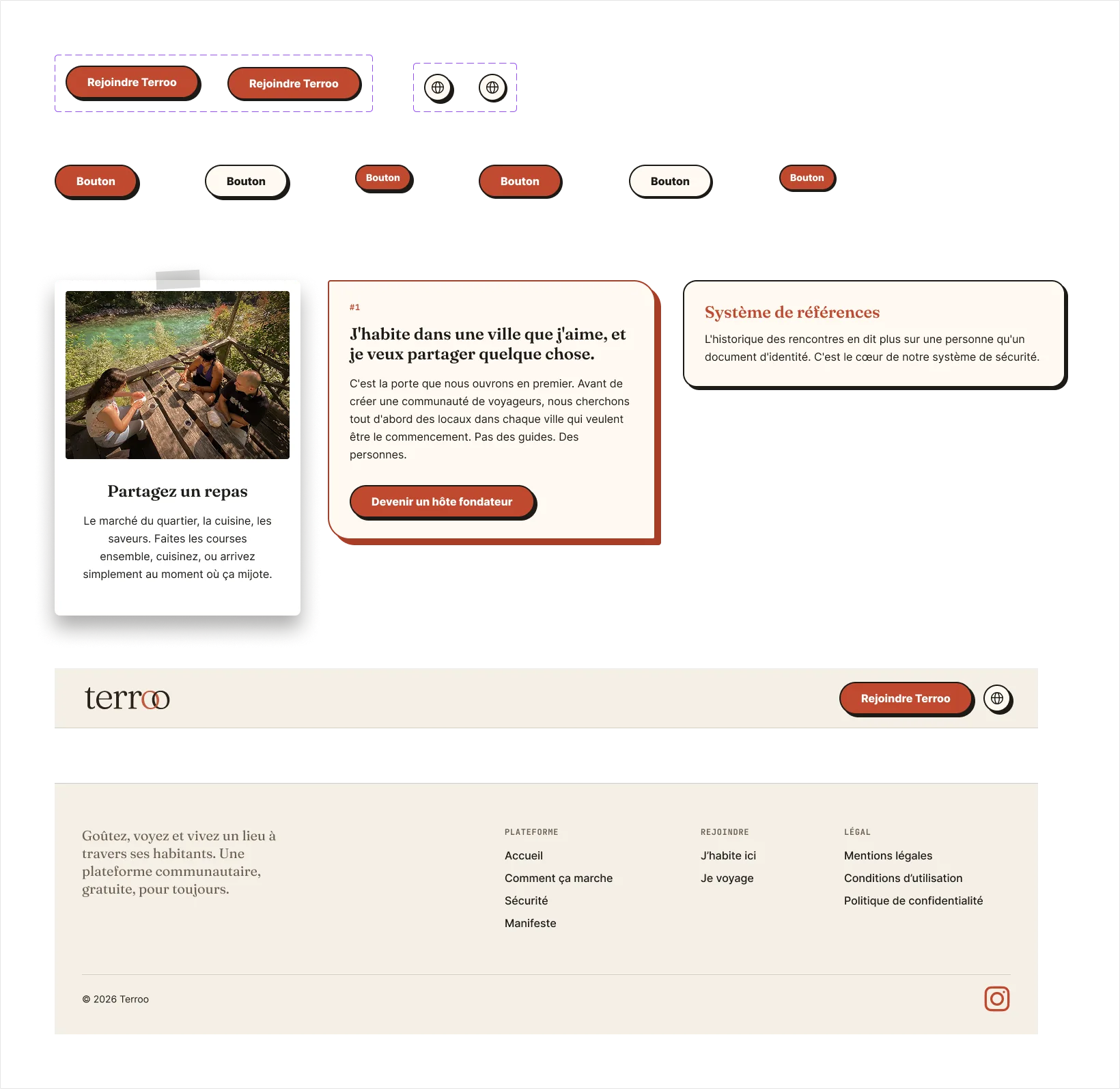
Buttons, cards, form fields, footer, all named and organized the way you'd actually hand it to a developer.
A brand that holds up page after page
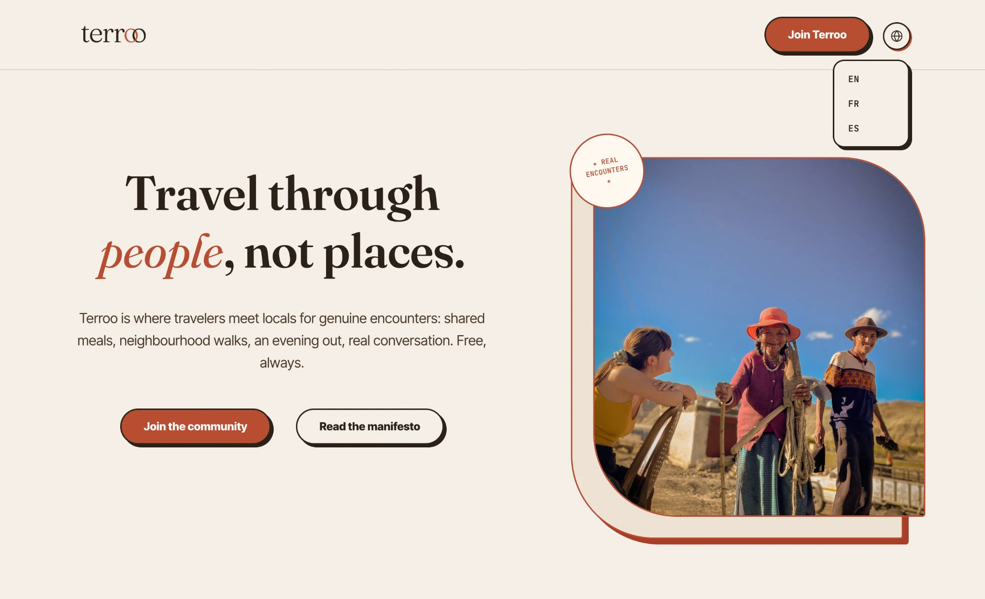
The homepage hero, translated into English, French and Spanish.
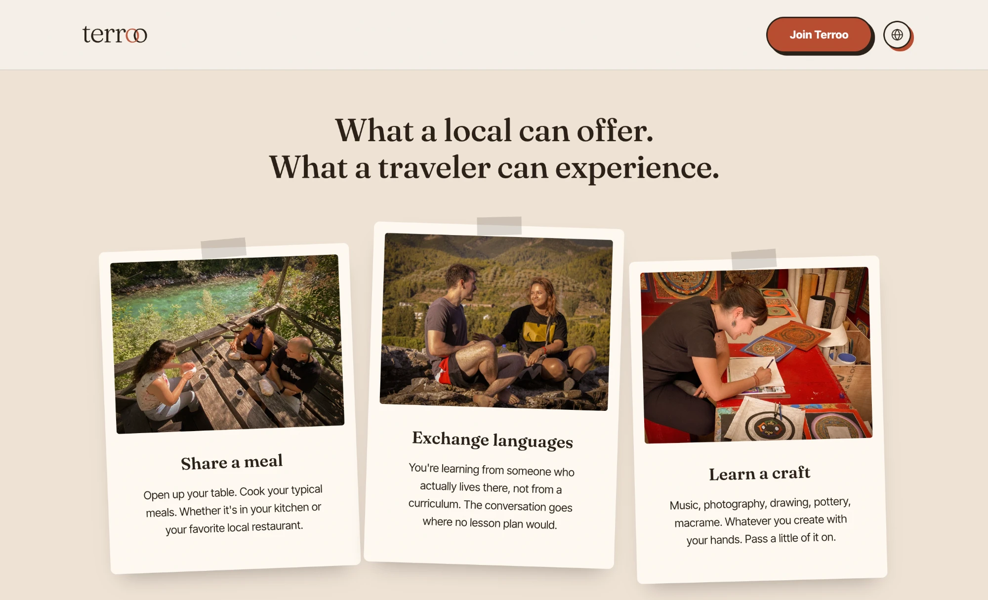
The postcard treatment from the Figma library, shipped exactly as designed.
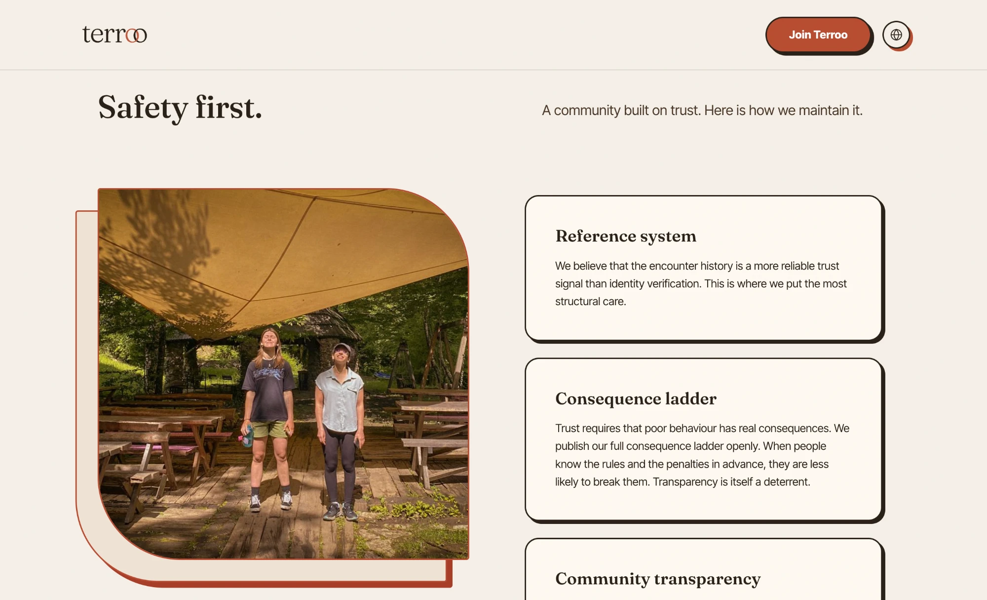
Safety first, explained before a single encounter happens.
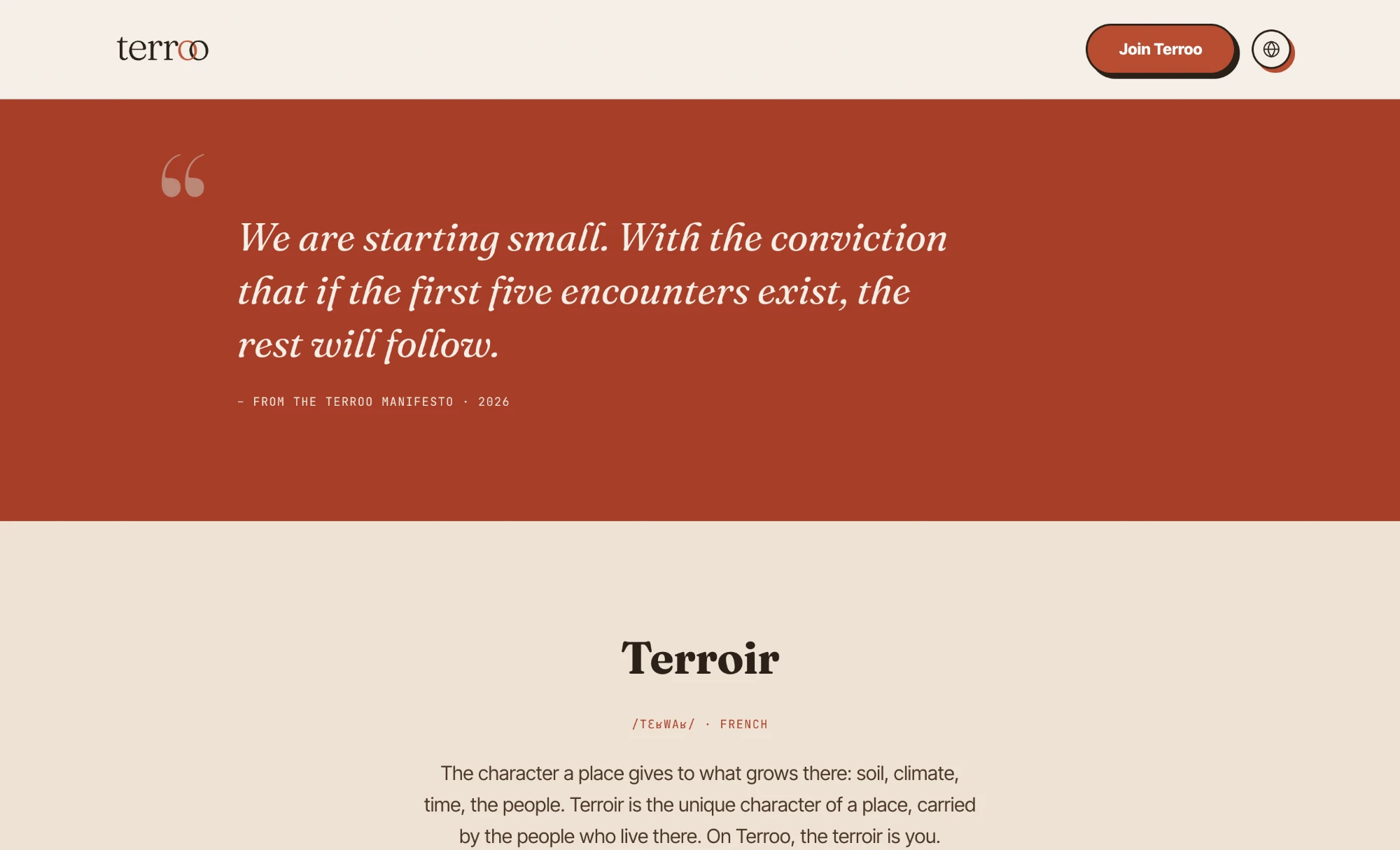
The manifesto voice shows up section after section, well past the homepage.
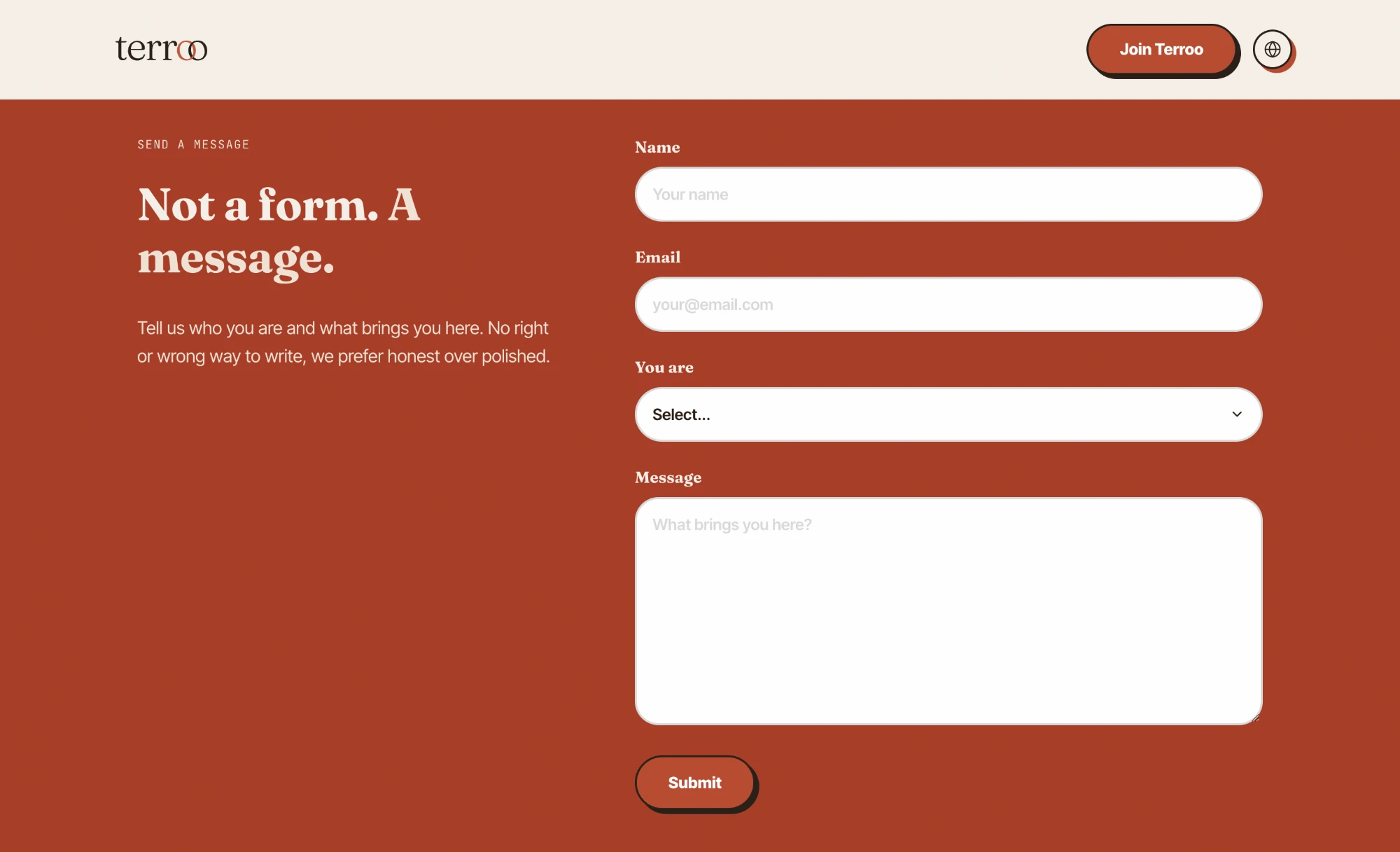
Even the contact page sounds like Terroo instead of a generic ticket form.
A WordPress theme the founder can run without me
Design and brand were only half the brief. The founder needed to edit the site herself, down to a single typo, without opening a ticket with a developer every time. I built Terroo as a custom WordPress theme on Elementor, with every block wired to the same colors and type styles as the Figma library, so the back office looks and behaves like an extension of the brand rather than a generic admin panel bolted on top of it.
The founder makes changes straight from the WordPress back office, no pull request required.
WordPress runs a huge share of the internet, so any future developer can open the project and understand it immediately, no proprietary platform to relearn.
Every block is a custom Elementor widget bound to the same design tokens as the Figma library, so new pages stay on-brand even when someone else is editing them.
Editing a page, live
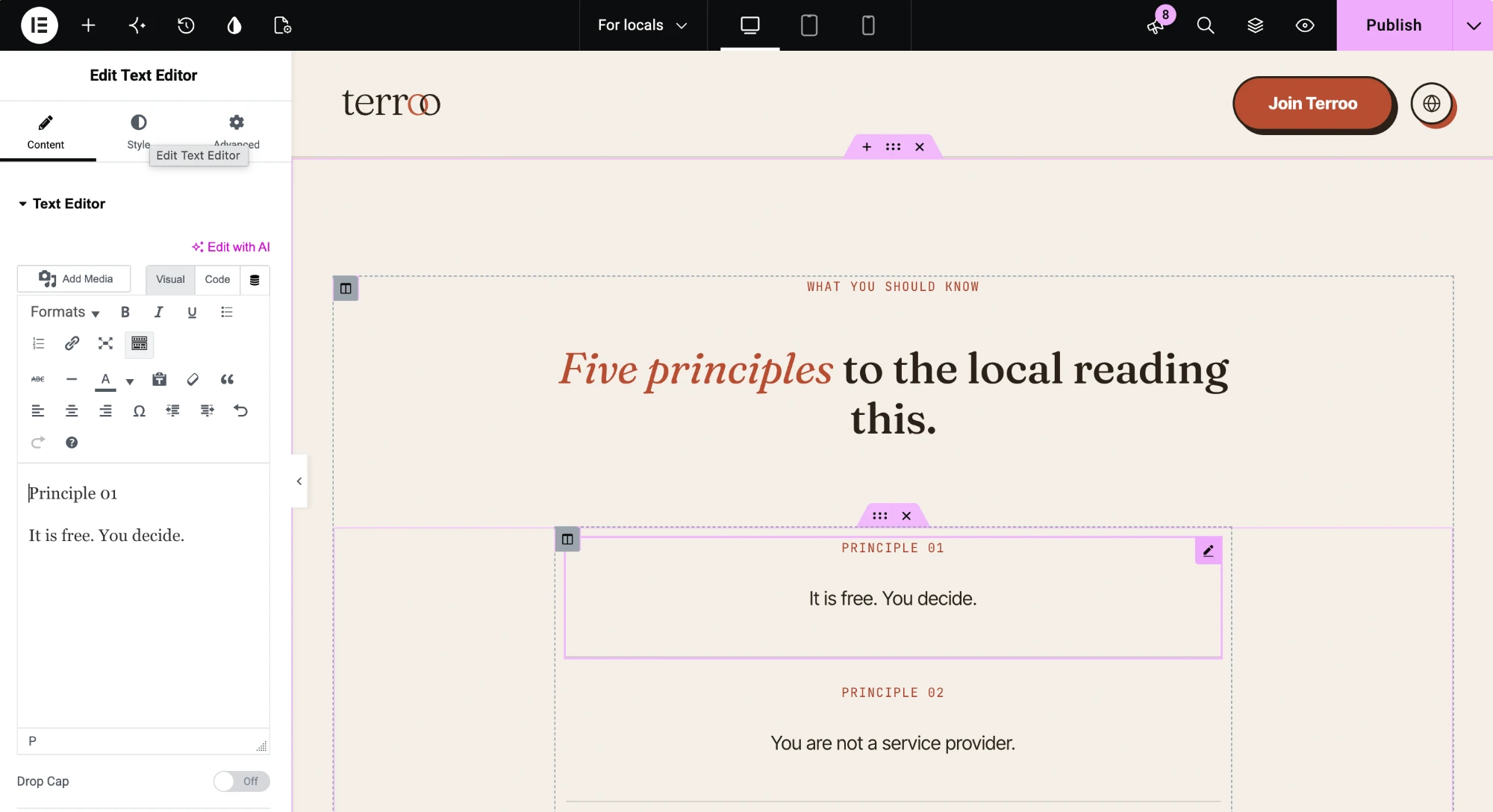
The founder edits this text herself, no developer required.
The site went live before the community did.
Because a product that people trust is the starting point for bringing people together.
See Terroo live
The site is live in English, French and Spanish. Browse it the way a traveler would, from the homepage to the principles, and see if it makes you want in.