

A yoga platform
redesigned to
look trustworthy
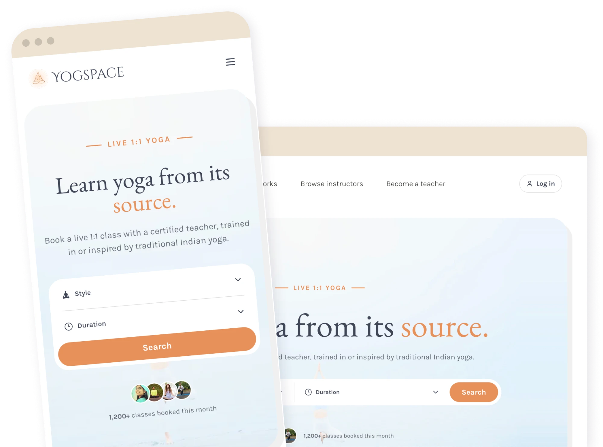
A working product that didn't yet look trustworthy
Yogspace connects students with certified yoga teachers for live, 1:1 classes taught in or inspired by traditional Indian lineages. This wasn't a blank page: the founder had already built and shipped it.
What Yogspace was selling was credibility: a verified certificate, a real lineage, a teacher worth paying for over a free YouTube video. The site didn't say any of that visually. Rounded pill shapes, a chunky display font, flat cream blocks with no depth, it read closer to a kids' app than a platform asking people to trust a stranger with their practice. I wasn't inventing a brand from nothing here. I was closing the gap between what the product actually did and what it looked like it did.
Type, color, UI system
Trust badges & certification timeline
Full Figma component library
Across the Next.js rebuild
Four decisions behind the redesign
The original type was a chunky, rounded display face that made a certification platform read as playful. I moved headlines to EB Garamond, paired with Karla for UI text, closer to a hospitality brand than a fitness app.
Learn yoga from its source.
EB Garamond / Karla
Every yoga app reaches for the same sage green or spa teal. I chose a warm terracotta instead, closer to saffron, a quiet nod to the Indian flag and the lineage these teachers actually trained in. Set against cream and a near-black navy for UI weight, it reads closer to a considered travel or hospitality brand than a template.
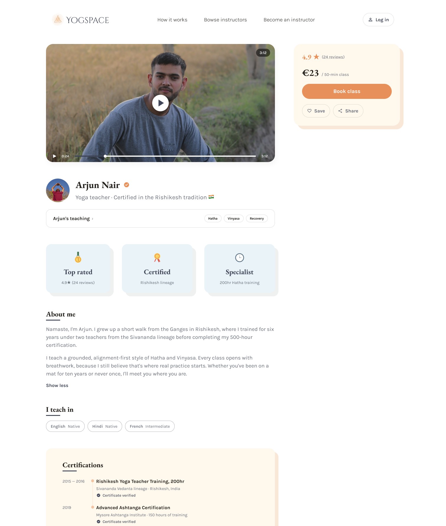
"Certified" meant nothing as a plain word in a paragraph. I designed a small set of custom badge icons (top rated, certified, specialist) and turned each teacher's certification history into an actual timeline, so the credential is something you can actually see.


I wanted these pages to feel soft and to breathe, the same two things a yoga teacher asks of you on the mat. Soft meant dropping hard borders in favor of warm-toned shadows that separate containers without a hard edge. Breathing meant fewer, larger blocks and wide open spacing instead of the original's dense run of identical pill shapes. Both exist to reassure more than to decorate: a calmer surface is easier to trust.
The result: a real component library
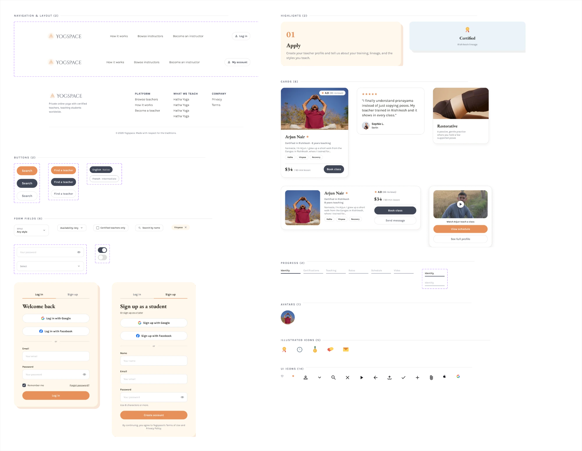
Navigation, buttons, form fields, auth cards, icons, all generated and organized in the same file the founder works in every day.
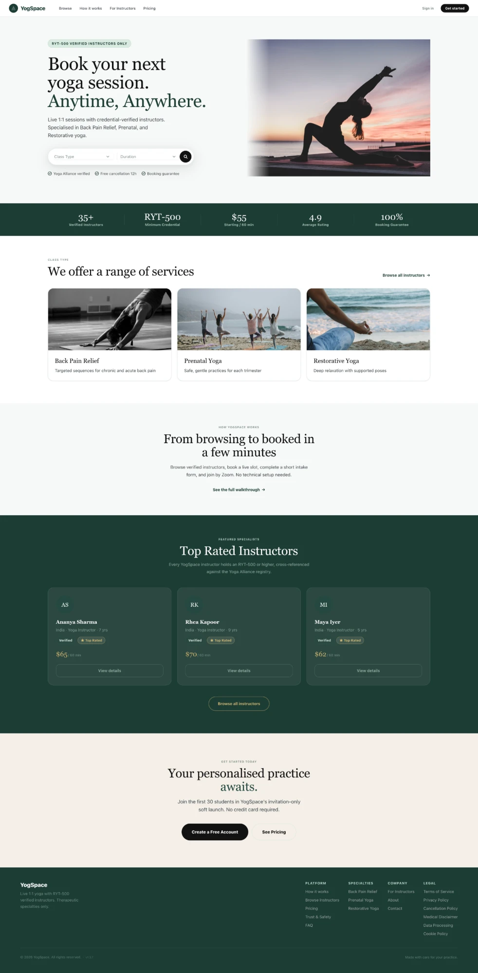
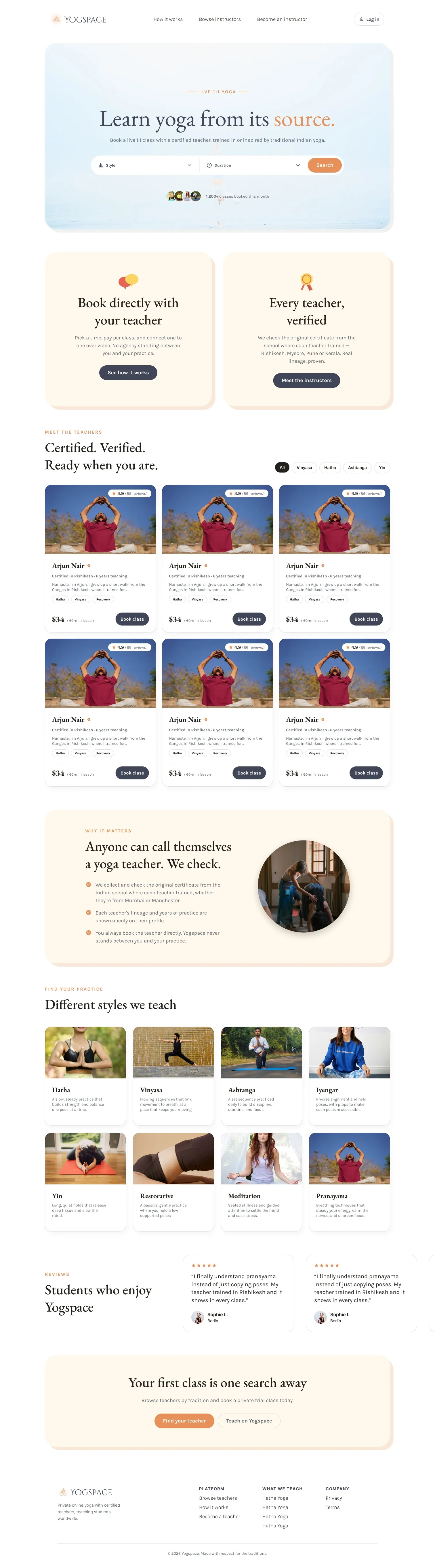
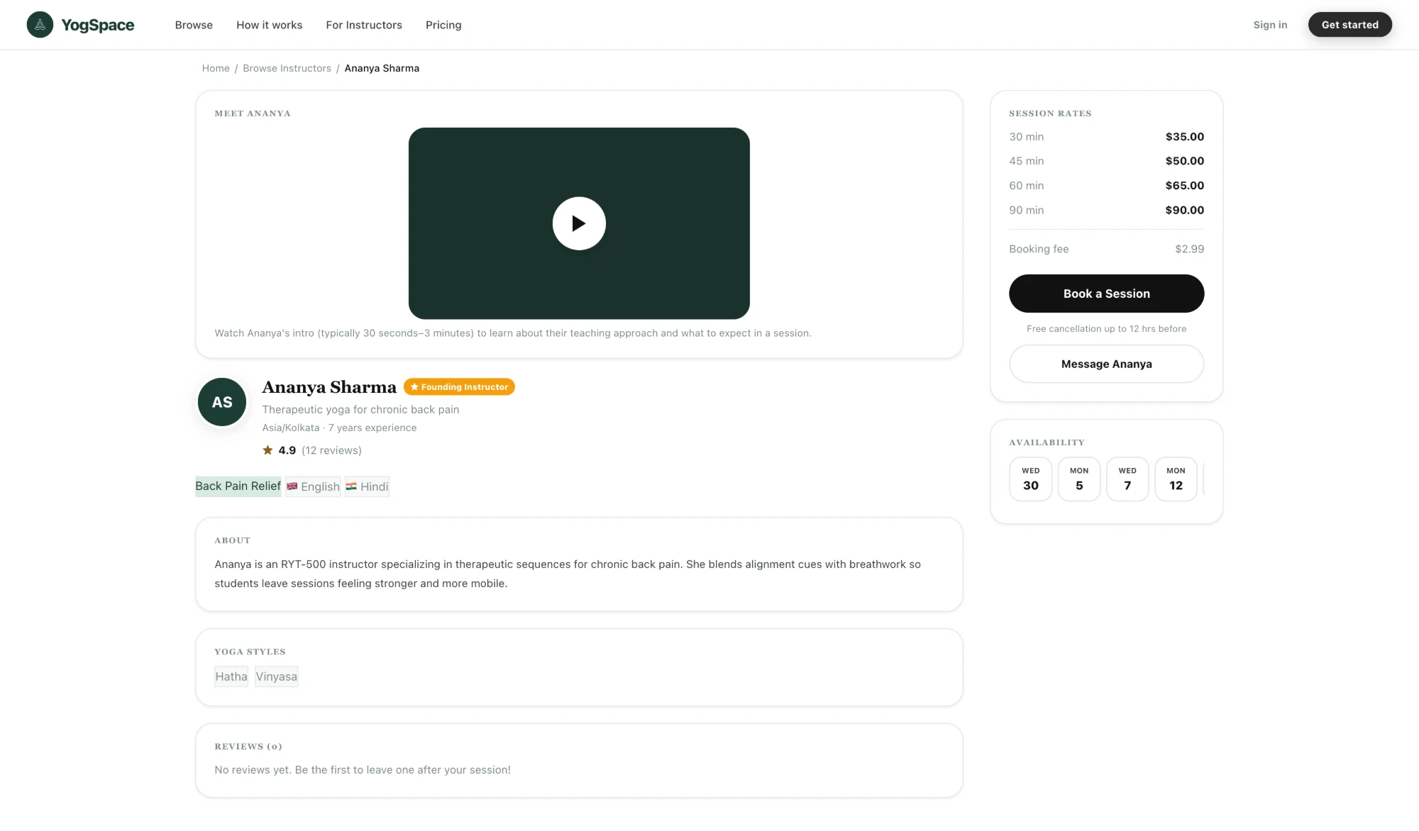
Two pages, before the redesign and after
The homepage went from a dense green wall with no visual hierarchy to sections that actually breathe: a confident search moment up top, then trust and teachers given room to be read on their own.
On the teacher profile, the plain session-rate list is now backed by three trust badges I hand-drew (top rated, certified, specialist) and an actual certification timeline instead of a bullet list, so the credential the whole platform depends on is the thing your eye lands on first.
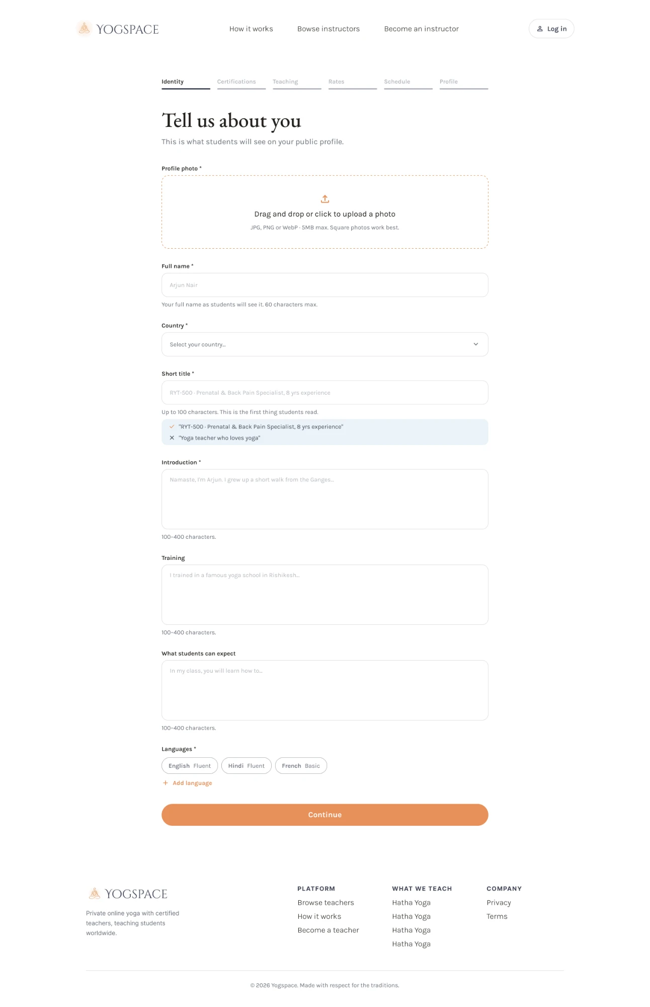
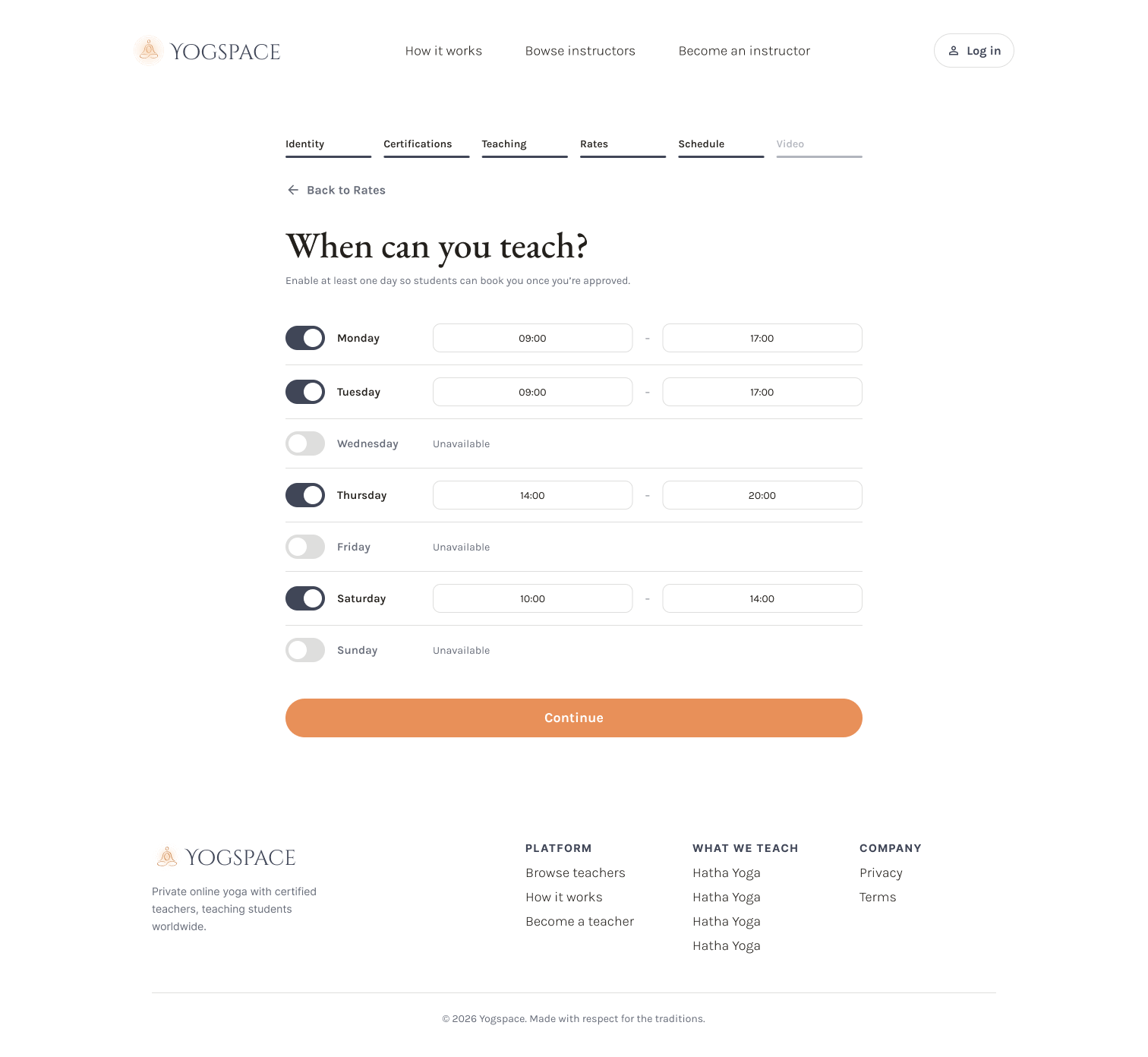
Turning a six-step signup into something teachers actually finish
Getting a teacher from sign-up to a bookable profile meant collecting a lot: certifications, rates, a weekly schedule, a video. The real work was in the form itself, structuring that data in a way that meets teachers where they are, since not everyone has every answer ready on the first pass.
The teachers and the lineages were always real.
The design just needed to show it.